
˙⋆✮
BRANDING & MERCHANDISE
✮⋆˙
A selection of the merchandise created for band: Bring in the Clowns
album covers

"The Hollow" is a dark, moody, heavy set of tracks that keeps the listener interested in the story and meaning. I wanted the album cover to reflect the feeling of brotherhood and moments of discovery within the album. The dark background, with sketches that mimic scratches, conveys the heavy mood of the album. The wide-eyed expressions, with a slightly subdued look, convey the moment of curiosity and bewilderment that "The Cracked" are facing. The intentionally messy characters leave space for the viewers to see themselves within these characters.
tee shirt designs


My goal with these designs were different for each piece.The second piece pictured here (upper-middle) was a concept based on the Sicilian folktale: "La Marabecca", the amphibian-like creature that lives inside wells, and pulls children inside when they play too closely. We brainstormed a character that we lovingly named: "The Little Guy" and left him standing fearfully, hidden behind the tree. If you look inside the well, his fate has already been foreshadowed.With the first piece pictured here (upper-left), I wanted to create something silly but heartfelt, using the same character "The Little Guy" but in his alter-ego state. This piece was intentionally witty and not meant to be taken too seriously.
It ended up being our best-seller of the night!Overall the intention for the brand was to create a dark atmosphere, often using bright colours on a dark background.
sticker designs


The overall goal with the stickers were to create something fun, silly, simple, and immersive to the viewer.
We decided to create a surprise pack of tarot-style stickers that visually connected to the lyrics in the album. The surprise-pack consisted of 4 random cards from the 8 existing card styles. Each pack always included one rare card.
logo designs

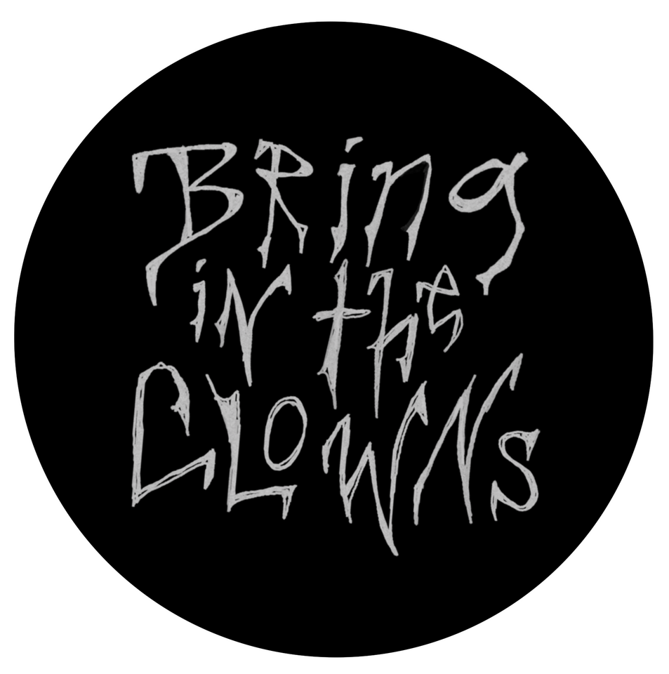
Logos created for the band: "Bring in the Clowns"